I have chosen the book Tales From Earthsea, as i am currently reading it and I enjoy reading it. Tales From Earthsea is the fourth book in the series of Earthsea written by Ursula le Guin.
I have chosen the book Tales From Earthsea, as i am currently reading it and I enjoy reading it. Tales From Earthsea is the fourth book in the series of Earthsea written by Ursula le Guin.
What ideas does your work explore?
My work explores the relationship between scenery and pixels. it also explores what colours work well with one another, and how using similar colours improves how relatable an image is.
Who or what is your work influenced or inspired by?
This work was inspired by video games and other pixellated images I had recently browsed.
How did you develop or create your work?
I developed my work by using many layers on photoshop, consisting of varied opacity levels, and an extensive amount of attempts to resize the image to A4(almost). During the process of placing pixels, the pencil tool and the eyedropper tool were very useful.
What elements of art does your work focus on? Why?
My work focuses on Colour, Shape, and pattern. colour is demonstrated throughout the image, in the trees, the sky, the clouds, the water, and its reflection. Shape is demonstrated in the square pixels. Pattern is demonstrated in the water and clouds where the colours interlock with each other.


![]()
Inspiration list: Atari, Gamecube, Gameboy, N64, Pixel, SNES, Commodore 64, 3DS, Pc, Elder Scrolls, Fire Emblem, the colour blue.
Brainstorm: Pixel – People – Robots – Art – Gif – scenery
Model – Origami – Boxes inside boxes – Popsicle sticks
Drawing – Landscapes – Objects – People -space
Tutorials for image pixelation:
http://smallbusiness.chron.com/make-people-look-pixelated-photoshop-37943.html
Landscapes:
Landscapes that could look good if pixellated:


Attempts at pixelating images:


Inspiration


progression
Are you happy with your design? Why or why not? I am satisfied with my image as it shows the design elements, shape, space and colour in the final design.
What would change? I would change or add more detail to the shoes the person is wearing.
What wasn’t successful? the colouring of the jail cell was slightly darker than anticipated.
What design elements and principles are evident in you work? Describe how they have been used and where they have been used in your artwork? (please list at least 3 design elements and principles for each artwork) Shape-the prison bars and the rectangular bed both use shape. Space-Space is used to mage the bed ant the pillow look more realistic. Colour-Colour is used all over the image to show difference in shapes.
How would you do things differently next time? I would’ve added a more realistic look to the cell and clothing.
final image:politicalposter
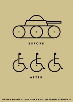
In this image I see a tank above the word before, and people in wheelchairs over the word after, which is all above the words ‘Civilian victims of war have a right to quality healthcare’. This image appears to be a design made on a computer, consisting of many circles, and occasional rectangles. The image is asymmetrical, and consists of black, and a dark cream colour. There is also a use of thick lines connecting the circles, thin lines making up the words , and thick lines making the people. The people are overlapping the circles for wheelchairs, and there is a trapezium overlapping the circle at the top of the tank. The trapezium is also overlapping the wide rectangle used as the barrel of the tank. the circles are overlapping the rectangle at the bottom as they are distinguishable as the wheels of the tank.
The designer used the dull colouring and low contrast to show that the image relates to a depressing topic, in this case war and the lack of funds for returning victims of war to full health. It is symbolic that people that go through living in horrible conditions caused by war need help for something outside of their control, and that they deserve healthcare. The audience are the people that are in the country being protected as they will likely feel pity and empathy. The audience would relate if they have ever been in need or had seen someone who was in need of healthcare but didn’t have the money to get treated.
The subject of this image is the victims of war and suffering that have done nothing wrong to be injured(assumption), that are unable to pay for their recovery caused by war. This image is meant to convey civilians to donate money for healthcare to victims of war who have been injured by the brutality of others. This image uses images of people in wheelchairs to help viewers visualise the crippled victims, and the image of tanks to show the cause of this dilemma to people who don’t have time to stop and read what the words at the bottom at of the design say. This design makes me feel pity for the people that have been injured, disabled or even crippled by the battles waged between two powers. The image is clearly stating that people that have been affected by the war, and they need healthcare in order to fix the injuries received from being affected by a war that is out of their control. This design should be brought to attention to the united nations as the mass amounts of innocent civilians shouldn’t suffer for the sake of other people without consent.
Bibliography:
http://dosislas.org/pratt/spring15/comd202/police-brutality/


1.What did you learn during this task?
I learnt how certain eraser tools worked, and how to order layers to my advantage.
2.What difficulties did you have?
I had trouble finding specific layers to erase or add features.
3.What did you find most easy about this task?
It was easiest to duplicate layers, and to draw and erase in straight lines.
4.How would you do things differently next time?
I would work on the background more of all images, as they are all the same.
5.How would you change this activity for another class who were learning to use Photoshop?
I would implement the use of filters.
6.What design elements and principles are evident in you work? Describe how they have been used and where they have been used in your artwork? (please list at least 3 design elements and principles for each artwork)
Colour-In each image, the background used a consistency of a wide range of colours.
Space- in the last two images, the toaster has depth, width, & height.
Shape- In all images, there is a consistency of rectangles forming everyday objects.